
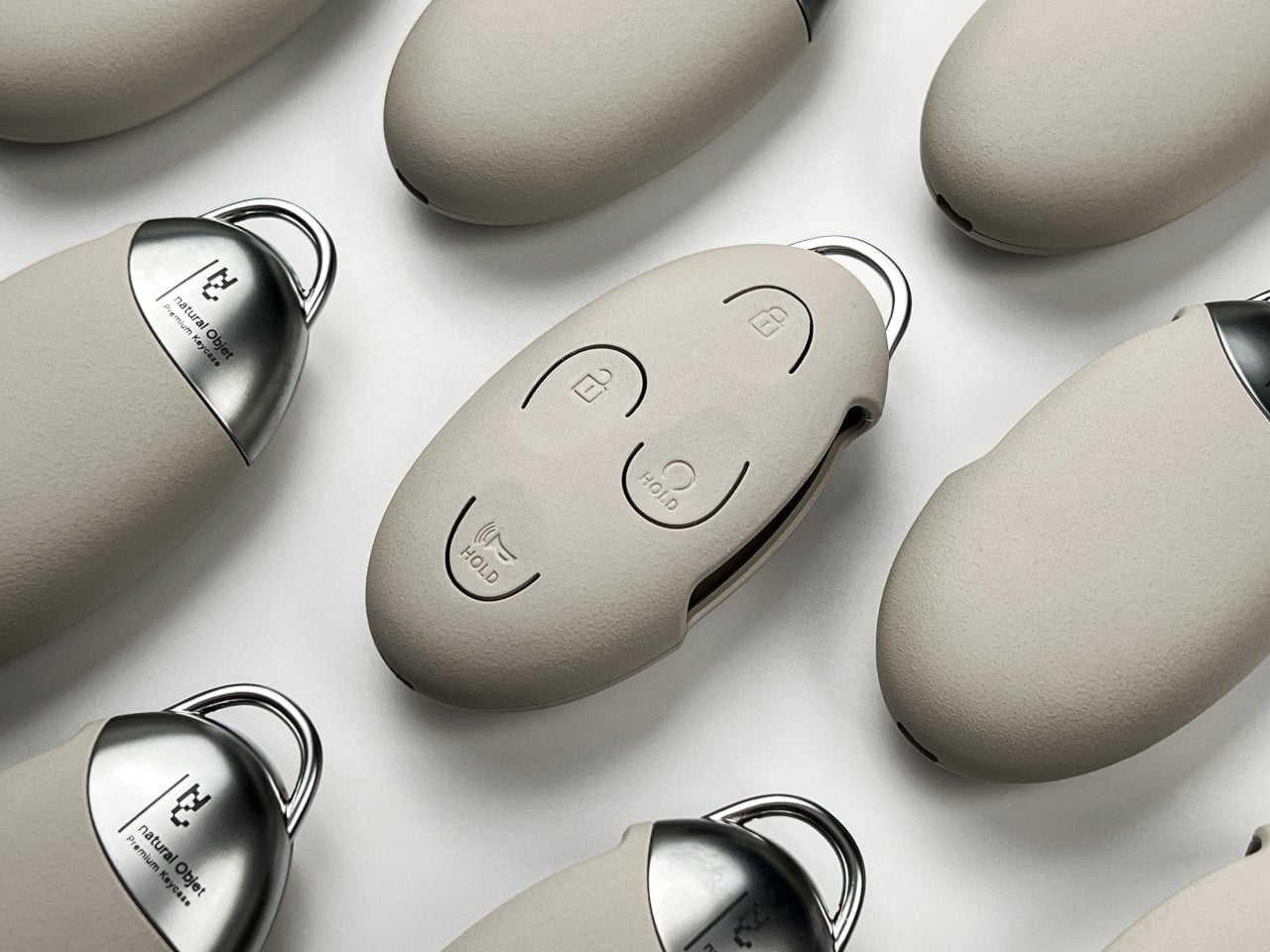
The Natural Objet car key cover is a beautiful lie, and I mean that as a compliment. It asks you to forget that your car key is a piece of electronics, to stop seeing the buttons and start feeling a stone. It is a small, quiet rebellion against the glossy, button-bloated remotes we all stuff into pockets, and it is almost certainly going to make you miss the unlock button on the first try. That friction is the point. This concept, a pebble-shaped shell with a grainy, sandy finish from designer Eunsu Lee, is not trying to be a better remote. It is trying to be a better object to carry. It is a sibling in spirit to the Aurelis bag is a wearable sculpture that forgot its shell, another concept that prioritizes tactile experience over obvious utility. Both ask you to trust your fingers more than your eyes.
The shell itself is a study in compromise. The button areas need to flex, but the case needs to hold its shape. ABS was too stiff, softer materials ruined the finish, so polycarbonate became the middle ground with repeatedly tweaked internal contact points. That is the kind of nerdy, material-level problem-solving that makes Spoot lean in. The custom coating aims for a sandy sensation, a deliberate texture designed to help you distinguish this pebble from the other smooth objects in your bag before you even look at it. A die-cast zinc-alloy section meets the shell at the back with an interlocking connection, not just a glued-on flourish, and a small loop gives the otherwise muted object a flash of shine. The palette, warm gray, deep black, earthy brown, keeps everything close to sand and soil. Even the packaging gets the memo: a translucent sleeve slides away from a folding kraft box, preparing you for the mix of surfaces underneath. This is a design that thinks about the hand before it thinks about the thumb.
But here is where the pebble meets its practical test. The subtle, curved symbols for lock, unlock, remote-start, and horn have less contrast than the original dark buttons on a Hyundai key. A quick glance becomes less useful. The curved borders have to do the work of guiding your thumb by touch alone. That is a genuine trade-off. You trade the immediate, visual clarity of a traditional fob for a more considered, tactile relationship with the object. It is a bit like the titanium glasses concept wears its brain like a badge, which refuses to hide its tech, but in reverse: this concept works overtime to hide its tech, and the cost is that you have to learn to find it again. The question is whether that learning curve is a feature or a flaw, and the answer depends entirely on how much you value the ceremony of the thing.
The specific consequence here is not about the key itself, but about what it reveals. We have accepted that our car keys should look like miniature remote controls because that is what they are. This concept proposes that they should feel like something else first. It will not ship, it is a design concept, and it says so plainly. But the detail to watch is the internal contact points. The designer had to repeatedly change them to make the polycarbonate press work. That is the razor clam in the spec sheet. If someone ever builds this, the feel of each press, not the look of the shell, will be what makes it succeed or fail. The stone is the story, but the thumb is the judge.