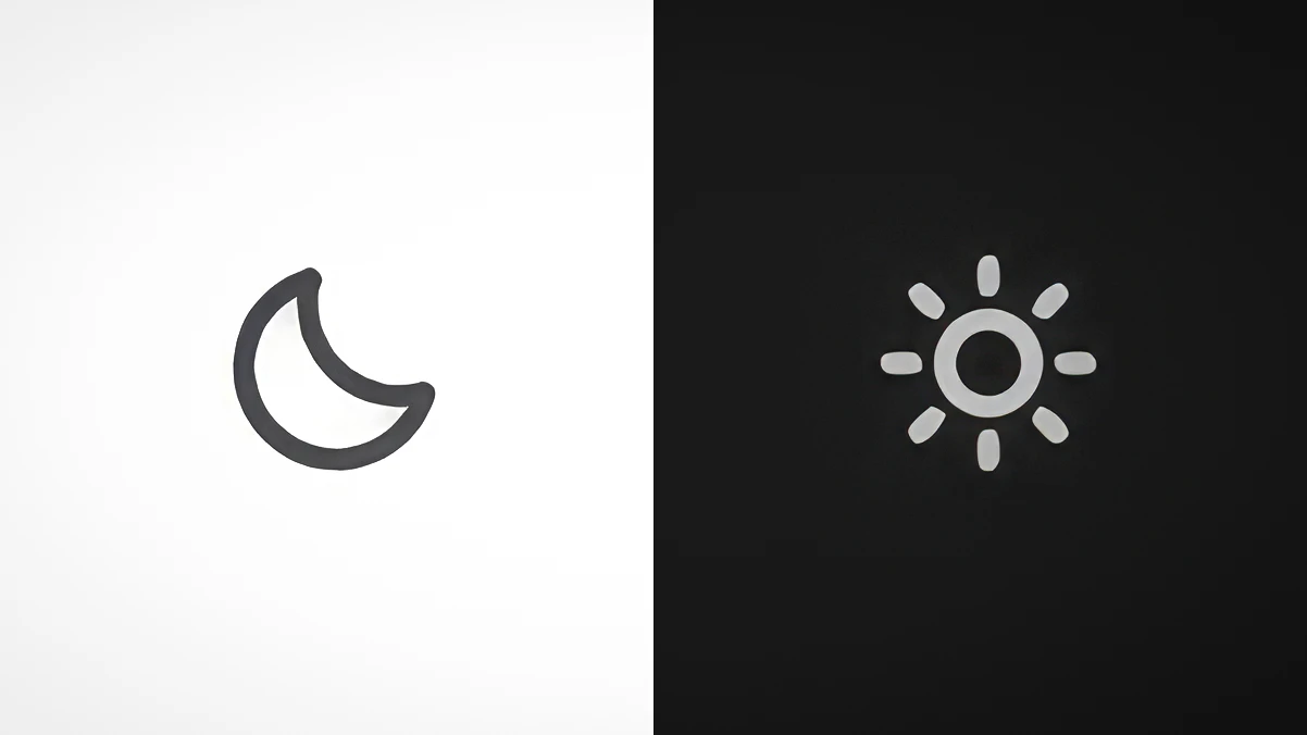
Finally. A dark mode that doesn't require squinting, a pillow over your face, or a browser extension that breaks every third page.
New Atlas flipped the switch on a light/dark mode toggle, and honestly, it's the kind of quiet, obvious fix that makes you wonder why it took this long, and then immediately forgive them because it's here now. Night owls, shift workers, and anyone who reads about weird inventions at 2 AM in a dark room finally get a site that doesn't double as a flashlight. It's a small thing. It's also exactly the kind of user-facing tweak that tells you a publication actually uses its own product. You know who else finally shipped the feature people were yelling for? Sonos finally ships the feature you've been yelling for, no new speakers required. Different industry, same energy: the companies that listen to the quiet, obvious pain points are the ones worth sticking with.
Here's the thing about dark mode, though, it's not just about comfort. It's about attention. When your eyes aren't fighting a glowing white page, you read differently. You linger. You notice the weird detail in the third paragraph. You actually scroll down to the spec table. That matters for a site that covers Nothing's new AI gadget ships next month with no screen, just questions and This A-frame cabin trades rustic for a surprisingly modern two-person layout, stories that reward the kind of deep, curious reading that happens when the interface gets out of your way.
So no, this isn't a launch event. There's no crowdfunding campaign to vet, no shipping date to question, no razor-clam detail hidden in a press release. It's just a toggle. But it's a toggle that says: we see you, reading at 1 AM, and we're not going to blind you for the privilege.
The concrete takeaway: if you've been avoiding New Atlas after dark because the white background felt like a personal attack, your excuse just evaporated. The dark mode is live. Go find something weird to read.